In Memoriam: The Tricolore

It was a simple time. Team kit was understated, with black shorts and a few colored panels on the jersey. Race Leader and National Championship jerseys were plain, and often even lacking in the name of the sponsor. National Championship jerseys in particular were a matter of national pride more than sponsorship; it was an honor to fly the colors of your country in a jersey that payed homage not to the team’s branding, but to that of the nation’s flag. The jersey was worn with standard team kit, often in garish contrast to the colors of the sponsor. It was gloriously Casually Deliberate.
Then, as more money came to be at stake and the sponsors became ever more loosely tied to Cycling’s history, it started to change. First with the shorts, which were modified to match the jersey, either with different accent colors or with an entirely matched design. Then teams started discouraging their riders from winning national championships and, if left no choice in the matter, they chose a design which matched the standard team kit design as closely as possible in order to maximize sponsorship investment.
The first time I noticed this trend was an account from Roger Hammond, the reigning British Road Champion, who had just signed with Discovery Channel. It was a matter of pride for him, of course, to wear the jersey but his new sponsor was not so keen and certainly held no special respect for the history of his jersey. After all, a national championship jersey has very little room on it for Discovery’s branding, and that meant a smaller return on their investment in the rider as a billboard. If I remember correctly, he was strongly discouraged – if not barred – from entering the race.
The Tricolore jersey is my favorite of any jersey available. If I were a Pro, I would carry a Dutch and not American license for no other reason than for the chance to race in the red, white, and blue stripes of the Dutch flag as opposed to the vertical stripes and star-spangled design of the American flag (however cool that jersey is as well).
To declare this In Memoriam is perhaps premature, but we are moving inexorably away from this glorious jumper; shorts are too often matched, bicycles too often repainted. I have nothing against maximizing a sponsor’s investment, but I worry over the consequences. I worry for the loss of standard team shorts, standard team kit, and the tricolore jersey. Will all teams follow Team Radiosanschelck?

Call me strange but i actually like how Leopard Trek worked the designs into the jerseys last year. Minale Design did good on that, I would’ve loved to get my hands on a swiss champion kit from last year. Now it’s too late and i’ll have to satisfy my need with the radioshack version….. At least it’s all red.
And the Moldavian national champion jersey from the leopard continental team is something i must have too.
Granted, they don’t rule the rider’s look like they used to but i love the subtle differences more than i probably could love a great big flag on their backs.
I think Garmin and BMC actually do a good job at reping national colors.
I’m so with you on this, Frank. What with textile technology these days, I’m half expecting to see a laser hair removal sponsor sublimate a forest of back hair on someone’s national championship jersey. Not to sound too down on capitalism, but the dissolving of borders in favor of multi-national corporations is sometimes a shame. I can’t get excited about rooting for IBM over Siemens at the Olympics.
BTW, did anyone else catch the bitchin’ board on top of the car in the background? There’s a fan with the right priorities.
Oh come on, that’s a bit glass half empty isn’t it… look at Gerrans last week, basically in the Australian team kit.
And in recent years we’ve had Hincapie’s Captain America kit which was a classic.
The Belgian kit has looked great on Gilbert and Boonen through several variations and teams and the Italian tricolore is generally pretty well adapted as is the French.
Just because a few teams/countries can’t get it right…
@ChrisO
Not at all, but I did applaud Gerrans on his spectacularly beautiful kit, didn’t I? A bit quick to throw stones on that one, I think.
I never liked Hincapie’s recent kits, but his kit in…’97 was it…was spot on. A cool jersey, just not as class as the tricolore.
The Italian jersey has gone wonky with the three horizontal stripes lately, but the French and Belgian kits worn by Tommy V and Gilbert are, in my opinion, a classic example of over-matching. Especially Gilbert’s kit from last season. This season, I find it a shame his bibs aren’t just the red team issue bibs as the black grippers would be a great accent.
@Jeff in PetroMetro
I love it!!
Its hard to balance between corporations making money (which they should) and retaining our traditions. Things have to change and thats fine and the money coming in also does a lot of good, but that doesn’t mean we can’t appreciate things the way they were.
@Cyber
Uh…Rule 16?
two of my favorite jerseys (i have france and belgium):
they’ve even got three pockets with button-closures. love ’em. i only wish we were having a real spring, and that it were cool enough out to wear them.
Some serious patriotism: Bastille Day bicentennial attack by Fignon and Mottet. Systeme U with the tricolor bar tape, with some trumpeting.
http://www.youtube.com/watch?v=jjgOFXcItWE
It’s not that I disagree only that I have, for the most part enjoyed the evolution of kit. I was lucky enough to have a really fine wool team jersey back in the pre Lycra days and there was/is nothing like it. But Lycra is so easy and the graffics took off so that I don’t look back. So there are some designs that are awful but when I look at those pre 90’s kits they do seem simple and from a bygone era. Ok so we have left behind Cipo’s zebra, skinned muscle anatomy etc. era but to me for the most part the peloton looks good and the national colors have become an insider add on.
Evolution of the US jersey:
http://www.myshavedlegs.com/2009/03/stars-stripes-blocks-union-jacks-and.html
Any similar timelines? I think it is fascinating.
Does Green Edge have more than one jersey this year? I swear that the ones they were wearing yesterday in G-W looked new/different than others they’ve worn. I didn’t even realize it was them for a long time yesterday.
I’ve been on a Basic Kit Kick for awhile now. Black bibs, black or white jersey with nothing on it. I border on looking too plain, but I prefer to let the Guns do the talking.
It’s also really, really damn hard to find the perfect jersey. Something very small, like pocket depth, can screw up an otherwise great jersey.
@DerHoggz
Cool link, thanks for sharing that one!
Personally my favorite jersey out there currently is Farnese Vini. Of course it is way too busy with sponsors, but the base kit I really like, especially the yellow piping on the bibs.
@DerHoggz
Thanks for sharing. I always loved the RMO jersey and Charley Mottet, with those superb red Rivat shoes was a favorite rider.
I think you can throw Garmin’elo into that mix as well. I do however, like the huge ‘e on the back of the kit.
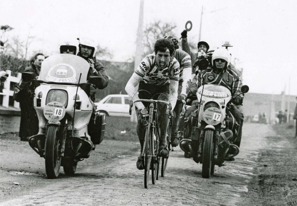
Sponsor placement has been prevalent since at least the switch of national teams to trade teams. The change, at least in my mind, was the introduction of sublimation. Santini pushing the envelope with the La Vie Claire kit opened the door to more than just block and panel kit design. Sponsors just took advantage of the opportunity. Take the King here, in 69; Faema pre-embroidered block is stitched to the jersey that has clothing and Tour sponsors placed.
Plenty of flocked and iron on sponsor placement here for the Professor in 81:
The crime is the switch to colored socks or worse, black socks. And of course all white shorts.
What I really miss is the Combine jersey and classment in the Tour.
While I certainly respect the cycling tradition, I kinda like the more recent takes on incorporating national colors into the kit.
@jimmy
Good post.
This guy ?? Off the front ?? Sure !!
not really tricolore, but I think Mark had one too many of them Belgian ales when he was in Gent-Wevelgem…
Geroge in 1998 looks freakin’ great. Gotta agree with Fronk… the rank commercialism has really detracted from the honor of wearing ones national colors of late.
Fuch – I’m trying to start a Kit-coup as Frank and Gianni are somewhere over the North Atlantic and Brett is probably in the middle of some crazy layover in North Africa or something and I can’t even post in the right place. Again:
Alright then peeps – I’ve started working on the other Keepers about the next V-kit iteration being something of a throw-back design. Not necessarily wool – modern materials, same as we’re doing – but a throwback/tricolore pattern. The witte kit is a step in that direction from swarte but it could go much further. Who’s with me?
@Marko
Sounds great! Thinking of any particular classic design as a base from which to work from?
@Marko
YES.
Also, now is prime time for you to grab the reigns of power while they are away. coup d’etat. I know you want to change those log-in passwords for all the backend admin stuff…
@Marko
The guys and gals at Pisgah Works in Asheville are turning our some pretty sweet wool items if you are so inclined… http://www.pisgahworks.com. I don’t know anyone that works or owns the place (to the best of my knowledge), but I have one of their long-sleeved wool retro jerseys and is the shit. Not cheap, but comfy, well made, and durable. They do custom work.
@Jeff in PetroMetro
Gonna have to disagree with this one. Whilst the owner IS at the proper event, that board ain’t so bitchin’. Windsurfers are to surfboards as recumbents are to road bikes.
And don’t get me started on this paddle board phenomena.
@pakrat
Start, start…
We’re in the same boat. Unless it’s Liard Hamilton with a paddleboard, cos he can do whatever the fuck he wants.
@Marko
Thought that might have been misplaced over there…personally I have a slight issue with retro styled gear in modern fabrics, but no doubt you’d get it right before production begins.
If you are thinking of heading down the woolen track, can I suggest a warm up jacket? Seems to be the perfect for velo related activities where one is in casual garb (spectating, pre & post cogal refreshments, etc)
I do enjoy the ‘simpler’ kits. Regarding the design of National Championship kits, it must be a total pain in the ass for whoever designs them given this:
1.3.069 The specificities concerning the design of the national champion jersey are described in the brochure available on the UCI website. These specificities are applicable for all the disciplines.
Before production, the national champion jersey design (colours, flag, drawing) reproduced by the titled rider must be approved by the concerned national federation and must respect the latter’s dispositions.
Each national federation must have its national champion jersey design registered by the UCI, for each discipline, at least 21 days before the national championships of the discipline in question.
The wearer of a national champion’s jersey shall be entitled to match the colour of his shorts to that of the jersey.
So you’ve got to make the UCI, the National federation and your sponsors happy. We need to go back to this:
Fags and Booze (credit to BRR!)
@scaler911
We do indeed need to return to these days. I’d wager the image was actually taken using a Hasselblad. Understated wool jerseys, steel frames, medium-format analogue photography. Everything that came after was ‘progress’? I don’t think so. Except for the removal of breast-pockets. That was DEFINATELY a good thing.
@pakrat
But, but, but…
He’s probably in the Alps. So windsurfing is as close to awesomeness as he could get that day. You know. TdF. Then windsurfing. I know windsurfing is to surfing as tri is to cycling, but…
@jimmy
I would point out that the yellow jersey isn’t a national champion’s jersey. Not sure why that even matters, but hey…
@Marko
TRi color orange, black,grey. Verticals, orange on top and grey at the bottom?
@Oli

Pretty clear on that. The article opened with Leader and National Champ jerseys. You of course are in a prime place to criticize, you get Black for NZ Champs and we end up with this:
@RedRanger
All the V a Dutch Monkey needs:
@jimmy
Ah, yes. Sorry about that, Chief.
All these retro jerseys are getting me to thinking I’ll dig out my La Vie Claire and 7-11 jerseys for the Tour.
Say what you want about Team Sky, but they have always honoured the national jersey. National colours + black shorts = correct. Now with Cav’s rainbow jersey they are following the same pattern. The black shorts are key.
@Bill
I just picked up a Z jersey. It’s very cool. I’ll add a 7-Eleven to it one day.
@Matt Carey
Indeed they do. They’ve been leading the charge in keeping it real.
@Marko
Sounds great! I don’t have any V-Kit so this is good news for me. I look forward to seeing what you come up with.
And a Z jersey acquisition, nice! The only PRO jerseys I like are all older ones. Have a cool Lotto one, a Banesto one, a really awesome Suntour one, and a very colorful Pinarello one. The only problem is that I’ve gotten very spoiled by modern kit – I love a race fit jersey with good snug pockets, full zip, and even like the “fourth pocket” for zipping up my house key. Now when I wear older jerseys with saggy pockets I feel disoriented.
Oh, and one of my most prized possessions is a super cool wind jacket all the TdF jerseys. Saw it at Prendas and it was too cool to pass up, even though the wearing of that jersey was before my time.
These are great, bu they are national team jerseys, not national champions (though I am not sure about the French one being team instead of champ).
That Big Mat rider is truly awful looking. Eeek, all that branding, the pink shades, the gold tape…the tricolor of the LOOK label is pretty cool, no need to have so much else going on.
As for Cavendish in hit kit this weekend during interviews – I liked it! Black shades, black bibs, white cap and jersey.
This is a great show not of evolution, but of artistic license being taken. I firmly believe that one should be required to wear the design issued to you on the podium, updated with sponsor names/logos only, and not allowed to change the design.
For something to mean something, it needs to be consistent. US champions are particularly guilty of violating this. Often is the case where road, TT & CX jerseys are all different.
@Marko
count me in and keep it simple!
Have to say, Chavanel doing a very fine job in a very cool-looking tricolore this year:
http://www.cyclingnews.com/news/photos/startline-gallery-day-1-at-de-panne/214449
@Touriste-Routier
Better?

Maybe it was just a Fignon thing, but here are shots of him just riding in jerseys with no team branding at all. The Tricolore, and the Giro, on two separate years. Seems the Giro for a spell didn’t have any team branding on it?
[dmalbum: path=”/velominati.com/wp-content/uploads/readers/frank/2012.03.27.19.35.23/”/]
@Touriste-Routier
Fucking this, mate. Well done. With the slight note that those three jerseys are actually different as handed out on the podium (I think) but they should just be the design issued. Totally agree.