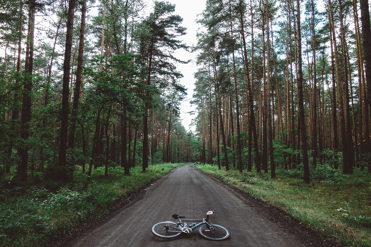
La Vie Velominatus: The Goldilocks Principle

The Rules are about cultivating a passion for riding our bikes to gain the maximum enjoyment possible. This requires humility, for one thing, and devotion, for another. It requires a balance between focusing on progress and enjoying the journey. It demands a reverence for our history paired with a hunger for evolution. The Rules teach us balance, to embrace the contradiction of opposing forces for the positive that each can bring us.
And so it could be said that The Goldilocks Principle is one of the fundamental tenets of Rule Holism. Along our journey to La Vie Velominatus, we will swing like a pendulum from left to right before we find our resting place somewhere between two extremes, whether in our training, our position, or kit, or even our very commitment to Cycling itself. No one can tell another where this balance lies; the path is for each of us to walk, we can only be shown The Way.
My STRAVA account is a good example of this. A beautifully designed service, this is a powerful training tool that lets you measure yourself against your previous performances and those of others. And therein lies the rub: since my return from Belgium, each ride I’ve been on I’ve buried the pin going after a KOM or personal best on a particular segment. This, of course, is the principle danger in training by numbers and flies in the face of Training Properly. But the tool is new to me, and I will allow myself this dalliance on the condition that I learn to cope with the pressure of having a computer that is recording my ride for future analysis. Failing that, the computer will be relegated to use only on those rides where I wish to test myself. Balance.
But the Goldilocks Principle also applies to wearing of the kit – in particular the length of sleeves, shorts, knickers, and socks. We have seen a dangerous trend of late – spearheaded by the English-speaking population of the Pro peloton, into the realm where shorts flirt with becoming knickers, socks threaten to become shin guards, and short-sleeves portend to their supposed fate as three-quarter tees.
As Velominati, it is our duty to band together and provide guidance to the rest of the Cycling community of which we are part: boundaries give us definition, and definition distinguishes us from the savages. Looking at the peloton and my peers on the road, it is clear to me that it is our obligation to issue a refresher on The Goldilocks Principle as it relates to cycling kit fit:
- Shorts Leg Length: Whether worn with knee-warmers or not, the grippers on the legs of shorts must fall somewhere between the midpoint of the thigh and the base of the base of the rectis femoris. The rectis femoris is the muscle on your thigh that, together with the Vastus Lateralis and Vastus Medialis form the shape of a V on your guns. Under no circumstances should your shorts cover this point up, as it is one of the primary focus points of The V. The more massive the cannons, the higher the accepted line can be, though it should be noted that the reverse does not apply to lowering the line to cover up a pair of starter pistols.
- Socks Length: Socks must cover the ankle in its entirety, and should end just above the narrowest point of the shin. Under no circumstances may the sock extend to the point beyond which the calf muscle is reached or exceed the maximum width of the anklebone.
- Jersey Sleeve Length: Jersey sleeves must extend beyond the deltoid muscle and come to rest at a point somewhere between zero and twenty-five percent of the bicep muscle. This point should be determined when the arm is relaxed at one’s side.
- Jersey Torso Length: The back of the jersey must extend to a point beyond the waist and above the gluteus maximus. Ideally, the jersey should come to rest somewhere along the rearward up-facing plane created by the forward rotation of the hips and torso; under no circumstances may the jersey sag down beyond this point to cover any portion of the buttocks.
- Knicker/Knee Warmers: Knickers embody the very essence of the Goldilocks Principle when it comes to kit; this garment is neither shorts nor tights and their length should demonstrate this fact. Knickers/Knee Warmers should extend past the bottom of the knee joint to the point at which the calf is at its widest point. Under no circumstances should the lower extremity of said garment venture significantly past the calf where it may be confused with being a too-short pair of tights.
[dmalbum path=”/velominati.com/content/Photo Galleries/[email protected]/Golidlocks/”/]
Reference Tommy’s shoes, Levi Leipheimer had similar shoes with his name…saw them at the Colorado Pro Cycling Challenge last year. Check out an old Road ID advert.
Dammit, Frank! Two seconds!
@frank
Why would you want your name on the outside of your shoes – I mean is it something that you’re likely to forget whilst focusing on your magnificent stroke or some such and that having a quick “crib card”, albeit upside down and backwards, can get you out of trouble with difficult questions in those post race interviews such as “What is your name?”
Since Voekler’s nickname is the housewives favourite, if you find his shoes under the bed you know who to blame, kill or congratulate.
@ChrisO
That Jez Hunt kit in in violation of many Rules. On one hand it is not the authorised national champions jersey as required by the national federation and two it is fucking awful. This is a clear violation of The Rules.
That Jeremy Hunt kit is the perfect example of why the Union Jack doesn’t work for a jersey. Its either entirely overpowering or it looks pasted on, like a military patch. In the Banesto example its both. Even Kristian House’s Rapha Condor kit from a couple years ago would have been so much better without the flags on the shoulders (which I think actually are patches), though I’m kind of digging the red and blue grand tour gloves he wore.
Great article Frank! Should be required reading for all aspiring Velominatus.
Oh, and that picture of the Badger is just freakin’ awesome. Portrait of a warrior there!
Jeez. For the sake of the podium girls, trim your damn hair burns, man. Some of you need to reconsider your recent approval, I think.
@Ron
And here we see them in their natural habitat…
@Ron I’m pretty sure the one on the left is actually kissing hair…poor podium girl consideration from the Modfather.
@the Engine Jaysus!!! Wear a fookin cycling cap & get a fookin haircut man!
@Ron
The one on the left is clearly thinking, “Is that in my mouth? Yes, it is in my mouth.”
Blech! – looks like they’re both slurping up that Paul Weller hair like spaghetti, Ladies & the Tramp style.
@frank
Those girls are way underpaid.
Fast forward three seconds…. “Phleh!! (Spitting sound)”
Pat McQuaid ‘Please eat some food or when you crash at le tour these will go SNAP’
i like wiggins, his sprint finish the other day was ace.
re: wiggins barnet, as the season went on last year it got shorter down to a skinhead in july. he’ll still probably have shit socks on.
Glad they avoided the union jack for the national champ jersey, that kit that Cav wore in copenhagen was nasty.
Whoever made the point that the union jack doesn’t need to follow the red, white and blue to make its point was right. I like the Stella McCartney GB olympic kit:
@motor city
If that’s really the kit, that is sooooooooooo much better than the old design. My goodness my Guinness, Stripey-wavey-dual/trippletone design had me confused in seven different languages and four different ways. And I only speak two languages well, and two poorly. That only adds to the problem. I’m glad they sorfted their kit out, though if they just did the design based on the RR jersey, it would be good and recognizable, yeah?
Stella McArtney is a good designer though, huh. She’s done some other great work and I’m thrilled to see her do the kit for the Olympics. Good on her!
@motor city
I’m also impressed that the girl (should I now her name???) in the swimsuit has the capacity to both smile and flex her abs simultaneously. All the others can do is make a slightly-less-than-constipated expression.
@frank I’m sure they partly chose McCartney because of her who her dad is. They are trying to stretch the heritage / culture aspect of the games as much as possible.
Its Jessica Ennis (heptathlete). She doesn’t swim, she just wears that style outfit because she can get away with it.
@motor city
She can hep my tathlete any time. grrrrrr
@motor city
Mmmmm Jess Ennis – or Justine if Brett meets her.
I don’t think I’d remember my own name, let alone hers…
@motor city
I’m really not a fan of the new British Olympic kit, it’s a bit bland and verging on grey compared to the simple red and blue we had previously.
It may be complete coincidence but Paul McCartney bugs the shit out of me as well.
Looks like a bank logo needs to be on there somewhere. I don’t think it’s very well integrated into the cycling kit at all, looks like it’s just blocked on without considering how they look on the bike.
@frank
Even I know that spikes aren’t used in swimming events. What shoes are the cyclists wearing?
@the Engine
Looks to be adidas, as per logo on the tongue of Hoy’s shoe. They are also the only sponsor that makes shoes listed on the British Cycling website. I wish adidas had a stronger cycling market in US, I really dig them.
Goldilocks Principle: I realized my shortline was too low, so I did the bunch and got this:

This is two days after I was last out.
One thing with the bunching they all seemed to migrate in between my legs, annoying at first, but I didn’t notice after awhile. Does this mean my shorts are too loose? I feel like they might be in the nethers, the pad just kinda lays flat on my saddle, doesn’t wrap uo. Sounds strange to describe, but whatever.
Sussed they’re Addidas shoes but can’t see what kind…
Goldilocks principle #2: Socks.
I’ve find a great touchstone to measure the right lenght, the Cyclist Monument at the Madonna del Ghisallo.
I’ve never noticed before that the statues are full of details, have a look…
@Pedale.Forchetta
I’ve never seen that before, great statue. Is it wet, or does it have some sort of coating?
@Pedale.Forchetta
+1
One of my favorite spots. Note full Rule #33 compliance. Grazie Mille!
@Pedale.Forchetta
Perfect. The signs are everywhere, we just have to know where to look!
@DerHoggz
Sounds like they are too big, yes. It should all be tight and keep close to the skin.
@DerHoggz
Yes it’s wet, today was raining.
Here a view of the area.
Or the inside.
From the right to the left: a bike of Fausto Coppi, Merckx one, the Caloi of Fabio Casartelli when he died during the Tour de France, Gianni Motta and a bike used during the 1st WW. Under the Coppi bike you can see the yellow and the rainbow jersey of Cadel Evans…
Can’t go wrong with the classic stylings that Castelli produces, as long as your socks match your kit in accordance with Rule #28
@motor city
I think the track and field gear looks fine. Jessica Ennis is the only one looking happy cos her kit looks good.
Andy Murry looks awful and the cycling gear looks like some cast-off idea from the US Postal team circa 2000. The best GB ever was that of the 80s – blue body, red sleeves.. Black shorts. Classy and classic.
So much of the prep work for the Olympics has been a farce: ticketing, security, “politburo” traffic lanes for “dignitaries” sponsors and government yahoos. Have you seen the logo and mascots? Someone described the logo as Lisa Simpson giving someone a blowjob. That’s exactly what it looks like. Th mascots look like hillbilly cousins of the space aliens from the Simpsons.
For Lisa Simpson: http://www.guardian.co.uk/artanddesign/artblog/2007/jun/05/howlisasimpsontooktheolym
For the shitty mascots: http://www.guardian.co.uk/sport/video/2010/may/20/london-2012-olympic-mascots?INTCMP=SRCH
@frank
Well crap, that means my jersey and bibs are too big.
@wiscot
I remember mentioning to the VMH when this picture first came out that if Andy Murray stood in front of a dark background wearing his team kit he’d look like he’d been sawn in two and pulled slightly apart.
The only thing Murray is thinking is that he may be fucked. He is tennis’ version of weight of a nation. the queen was at Wimbledon a few years back to watch him play, what a mind fuck. kids only 24?
Murray – British in victory – Scottish in defeat. Actually I’ve just realised half the people in the picture are Scottish and somewhat more than half if you do it by weight.
@the Engine
so true. dont get me wrong. I like him as a player but he is not in the same league as the current top 3.
Andy Murray – drank from the same lucky well as Raymond Poulidor…
http://www.youtube.com/watch?v=OxWPdnjk3I8&feature=share
Pippi Longstocking dealing with the Swiss press
@the Engine
Yup, definitely a fan now. Dude seems chill and is quite funny.
@the Engine
Hilarious.