Bikes of The Tour 2013
How can we not talk about the Tour? After Sunday’s stage it’s hard not to be a little excited. Until yesterday the most thrilling thing I had seen was Mark Cavendish’s mad man chase back to the peloton after a late-in-the-race crash. He needed to get back quickly as the race was hurtling toward a sprint finish he was supposed to win. Happily there was a TV moto trying to follow him. For much of the chase he was without teammates, picking his way through the following convoy at high speed, jumping curbs, drafting cars very close, zipping around everything with millimeters to spare. He is a sprinter. These scenes are happening during every stage but the TV viewers miss almost all of it.
And now the rant…
Are all carbon monocoque bikes getting uglier as their computer aided design becomes more and more functional? Engineers are designing for a combination of aerodynamics, weight, stiffness but badass looks are not a design parameter. BMC has been crowing about some new software that produces the best design after a zillion Monte Carlo simulations but man, that damn thing is not pretty. All the monocoque frames must be heading toward the same computer derived solution, but not quite yet.
I’m sorry to offend Pinarello owners but the new Dogma is incrementally uglier than all the other preceding ugly Dogmas. It pains me to say this. I am a devout Italophile and longtime admirerer of Pinarello bikes. And I’m the one around here lecturing about form following function, but this bike is wrong. I realize the kinky stays and fork blades are shaped that way for performance, aren’t they? The frame looks like it stayed in the easy-bake oven too long and everything got a bit wobbly before it cooled. The front fork is a horror, the seat stays are bent the wrong direction, the chain stays don’t match.
The all carbon-weave clear coat frames are boring. Pinarello takes a lot of pride in their paint and for that I salute them. Luckily Sky’s and Movistar’s bikes are painted glossy and dark. It’s harder to see just how nasty the front fork is. With all the frame designs stuttering toward the same solution, it’s the paint that sets them apart. Matte black Orbeas and Bianchis look nearly identical until the orange or celeste paint goes on.
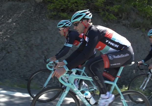
Trek has also been into the paint for its frames. Thankfully one doesn’t see a carbon clear-coat Madone. They have a new weight- saving paint this year and for the Tour they unleashed a beautiful mono-pantone “lei ‘o pard blue” (not to be confused with leopard blue) for the Shack rides. Now that is a paint job! The new Madone is ugly. There, I said it, but the damn paint saves its kammtail ass. Its head tube, or what used to be the head tube looks clumsy. At least the Trek bikes have a proper front fork and it’s painted that great color, as is the seat mast. Would I like the Pinarello if it was painted up like this? Yes I’d like it a lot more but I can’t get around the wavy fork. The first time I saw a steel Colnago with straight fork I fell in love. It shouldn’t even work but does. I’d never considered that a front fork could be straight. Straight fork yes, wavy fork no. Is it just me? Obviously it is as every Pinarello has a noodle fork and they are selling nicely. What does Ernesto Colnago say about a Pinarello? Believe me, I wish I knew. The Colnago C-59 is a fantastic looking bike and if that was painted completely “leopard” blue, my head might explode.
[dmalbum path=”/velominati.com/content/Photo Galleries/[email protected]/Bikes of the Tour/”/]
Well, you’re right!!! Dogmas ARE ugly, but the steerertube of the Trek isn’t much better…
I love the colour of the new Treks, however you can have too much of a good thing, lose the blue stem, bar tape and you’ve got a nice looking bike. At the moment it’s a bit too “Papa smurf” Just my two penneth
ya the dogma is bad and considering the price, im sure even the uber rich will pass on this one and get something else. the cannondale evo is nice as well as the specialized bikes.
http://www.youtube.com/watch?v=LCqbDnq7Ofs
Just seen the picture of it with black bar tape, now THAT looks the nuts.
Check out the custom carbon Formigli. http://www.formigliusa.com/cm/Home.html Renzo makes about 30 /month. The frame has a lifetime warrantee and he will repaint it for 200Euro anytime. It’s a nice option if you are looking for Italian style. We take all your measurement or Retul your old bike for the custom builds for about $75 at http://www.sdsmPeakPerformance.com.
@Greg
formigli is great!
My two cents:
I think Dogmas are pretty studly.
I think the new Radio Shack Trek’s paint jobs are super cool looking.
I love Cervelo but I HATE the S5. I think it’s the ugliest bike in existence.
Italian bikes with anything but Camagnolo are anathema.
Tubulars are a PITA
I’m tired of cleaning my white bar tape after every ride.
After about one hour of riding my cycling cap starts dripping sweat into my eyes.
I’ve lost 20 pounds so far this year, 15-20 to go.
I hate skinny little Mexicans on Super Record Ridleys that casually chat with me while I’m at redline in my 50X28 when they are in their 53X25.
I like the single color paint scheme, as it reminds me of some of the classic bikes such as the Pinarello, DeRosa, Gios, and certain Merckx bikes from the 70’s and 80’s. Unfortunately, the shade on the current Treks is too close to celeste, in my occasionally humble opinion.
@Cyclops
Great job on the weight dropping, that’s excellent. how many kms or miles do you do in a week?
My opinions:
the new Dogma is awful looking. Love the easy-bake oven analogy.
Disagree about the Trek — that colour looks like a neutered version of Celeste. Like they tried to go Bianchi but woefully missed the mark. The head tube looks like it was grafted on from another bike altogether. And the seat post and tube are way too small for the rest of the bike’s proportions.
I actually sort of like the new BMC’s minimalist and modern design.
Oh yeah — I also have grown very tired of the curved top tube design. Looked angry on the first few and now seems played out.
@thebaron
Yes! The Cannondales still look like bikes. I hope he doesn’t crash that beauty.
I sound like a cranky old bastard don’t I? Hey, get offa my lawn!
@cantona
For some reason it didn’t occur to me until today that the leopard blue was close to celeste. I think it’s actually much more blue than celeste green but then again, my wife and I always argue about what is blue and what is green and she is a painter.
Yeah, the Madone looks fucked, no way around it, but maybe it rides like a dream. It better. And BMC, I don’t know. That mini tube between seat and top offends me greatly! Thank god this is so subjective, I can feel the haters lining up to kill me for blaspheming about Pinarello.
@Cyclops
Skinny, talkative climbers, the worst. Can’t they see were working here?
@Gianni
I may be colour blind as well but that’s what it made me think of. The Pinerallo’s are ugly. Doesn’t mean they aren’t outstanding bikes, but it’s true.
those Dogmas are fugly.
best looking bike of the bunch i reckon:
@thebaron
150k+ per week.
@xced Since we’re showing off LOOKs – my 586 R-Light Limited Edition (#28 of 200)
Pinarello, lets just say they topped out with the Treviso. SL with the chrome fork. But those stupid cheapass decals pealed off too easily. And the Colnago straight blade fork on a Master? Just push the pedals and point, the bike does the rest. Those bikes are now for sunny Sundays..
@Paul 8v
I agree – change the fork to white, and go “normal” colors on the stem, seat pin, and bars, and you’re starting to look at a decent plain job. Its too much as it is now!
They stand out in the bunch, though.
@Gianni
Thank goodness someone was able to bring up a decent subject around here for once. I have to disagree with you that the Trek is headed in the right direction, but its better than many of the other abominations. Straight tubes, please. They don’t have to be round – just don’t fucking bend them, unless its for putting some rake into your fork for fucks sake.
@Cyclops
Johan disagrees.
Just mount them and stop whining about it. Then, when you ride them for the several months before you need to deal again, enjoy the superior ride.
(By the way, contis suck to glue on, but after gluing a dozen or so tubs, you pick up some tricks that make it way easier. Like laying the tire on a workbench, not holding it in a figure eight. Or dripping some glue onto a tray and using a small brush to apply the glue instead of the lid-brush abomination that comes with the Conti tub of glue.
Get some fizik microtex or performance tape. I cleaned mine once last year. On my rain bike.
Try shifting into your 53×25 or 50×21-23. You are spinning too high, prematurely causing your redline.
Oh, and Rule #5.
I have a Di2 S5. I got it for an insane deal, which is the only reason I bought it. However now that I have it, I really love riding it, and the looks have certainly grown on me. I have it parked next to a black Merckx EMX (w/chorus/record) so the two can exchange parry and blow (or hairpull and clawing) over who is prettier.
the bottom line with aero bikes, is that they’re a product of indisputable function. Whether that’s worth the price in looks or not, I’m sort of over that argument (like I am over campy vs shimaNO), PROVIDED THE LOOK IS LINKED TO THE PERFORMANCE. I don’t buy that any of Pinner’s awful curves are necessary – an aero seat post is a hell of a lot more beneficial than the curves in the fork or seat stays, yet they neglected it. Cervelo’s engineers pretty much have the patent on aero-effect. For all the hoopla over Specialized getting their own wind tunnel a couple of months ago, they turned down an offer to match the venge to the S5 for aero.
I probably don’t need an aero bike like this. In fact, I know I don’t, but goddamn is it fun to zip around on. Also has made me an electronic convert.
@xced those stems are awful.
Why I ride a custom made (for me) frame, made from Columbus Spirit oversize tubes, TIG welded and sharp as.
That Dogma looks like its melting…
And why are those Treks painted in Celeste?
Here are some proper curved stays. They are both hawt and functional.
Trek team bike is a good example of why Rule #8 exists!
I’m not a huge fan of aero bikes. I much prefer the classic lines of the of Cannondales and Cervelos. And the Tarmac.
There seems to be a reversing trend away from sloped to level top tubes with an angry curved period of mannerism.
spose beauty really is in the eye of the beholder…cannot stand that colour scheme on the Treks! Can’t really weigh in on the curved tubes, forks & stays given how my #1 is shaped.
@Mikael Liddy
I loved Celeste back in the 80s and still like it very much.
On a Bianchi.
This Trek color is way too close to Bianchi Celeste to be anything other than a cheap-ass rip-off.
In my opinion.
@thebaron
Yes.
Not just because I’m a cranky old Budgetatus Cannondale mamil: If you’re going to go Green, make it new.
@Nate
Kirk weren’t exactly known for good looking bikes.
@simon Different Kirk.
Bang on @Gianni! The only thing missing from the Dogma to complete the ensemble is one of these ugly bastards…
Celeste is only on a Bianchi – This should be a new rule.
Ha, first thing I thought about when I saw that lead photo was, “Goddamn, those new fucking aero headtubes are horrible.” Definitely a lot of ugly bikes out there. I own a sloping TT carbon bike. It rides well and I like it, but in terms of looks it doesn’t come close to my traditional geo steel bikes. It’s not quite ugly like some of these bikes, but I’d never say it’s sexy or pretty.
Nice work, Gianni!
Now, do I swap out a rider or live with my pics? No moral matters here to stand strong, not when a new frameset is on the line!
gianni, you and i seem to enjoy what we rarely get. I would sit through 10 hours of The View, IF, the producers would show cyclists chasing back on, the curb hopping at 50kmh, the fetching of bidons to be dispersed. theres a real beauty to it all, but perhaps it makes for boring tv for the masses?
trek blue doesnt seem anything like celeste to me. Celeste is celeste, and trek blue is maybe a tarheel blue all glossed up. I do like it and it would look a bit wild on the nago?
c59, go experience one. If the larger sizes ride the same as the miniatures do, ooh lala.
If the top tube isnt traditional ie sloped, it should be curved.
@Paul 8v
This!!!!
As was mentioned in an earlier thread. A bit of orange would make this the best thing ever a la
Not a fan of the trek colour or styling…..it’s like trying to copy bianchis celeste but asking a five year old to draw it! For me, and I hate to say it, the Taiwanese are knocking the spots off the Italians this year, those dark blue and black Giants with the gum wall tyres are stunning!
@Spun Up
Like this maybe ? http://www.baumcycles.com/bikes (The first pic)
@Tobin
Funny boy!
@roger
Yeah, we are missing much of the drama everyday. All the behind the scene fun too, I wish there was a journalist at team dinners or on the bus to cover life not during the race too. Glad to hear the Colnago is getting the job done.
A little bit of orange on Chavanel’s Chevy Camaro inspired S Works this year.
@Deakus
This is the one..
@cantona The colour isn’t going Bianchi, its the leopard blue which they have used for years…
@Deakus I’d ride that but I ride BMC.
So according to this article on road.cc ALL the teams are riding electronic Gruppos/Group-sans except those on SRAM and Europcar. As much as color and frame shape, isn’t this a pretty big shift? I’m still not sure why the pro teams see such big advantages from electronic to offset the lack of track record (and some high-profile failures like the one for Griepel). Aside from sponsorship pressure, are there any real compelling reasons for this migration to electronic?
My issue with the Trek is that the single colour makes it look slow. I think a bike needs some contrast of colour even if its subtle one.
Like last year, I think that the Europcar Colnago is best looking bike in the tour. Its just simple but classy.
@frank
Hallefuckinglujah. I thought it was just me. Every bike I have ever lusted after had straight tubes apart from Boardman’s Lotus which doesn’t really count.
It’s a toss up between the Colnagos and Canondale Evos for the Miss Peloton award although I’m not a fan of Europecar’s 100 Edition white livery.