When Kits Were Cool
 The modern day Pro cyclist has many disadvantages stacked against them by comparison to their forefathers. They have to ride plastic bikes with little or no distinguishing character or discernible caché; they must willingly or perhaps unwittingly subject their body to an array of questionable “training techniques”; and they have to spend every waking hour poncing around in public wearing gaudily coloured outfits plastered with a myriad of logos, half of them (thankfully) not even readable. No one wants to be a the face of gastric reflux relief, no matter how glamourous it sounds.
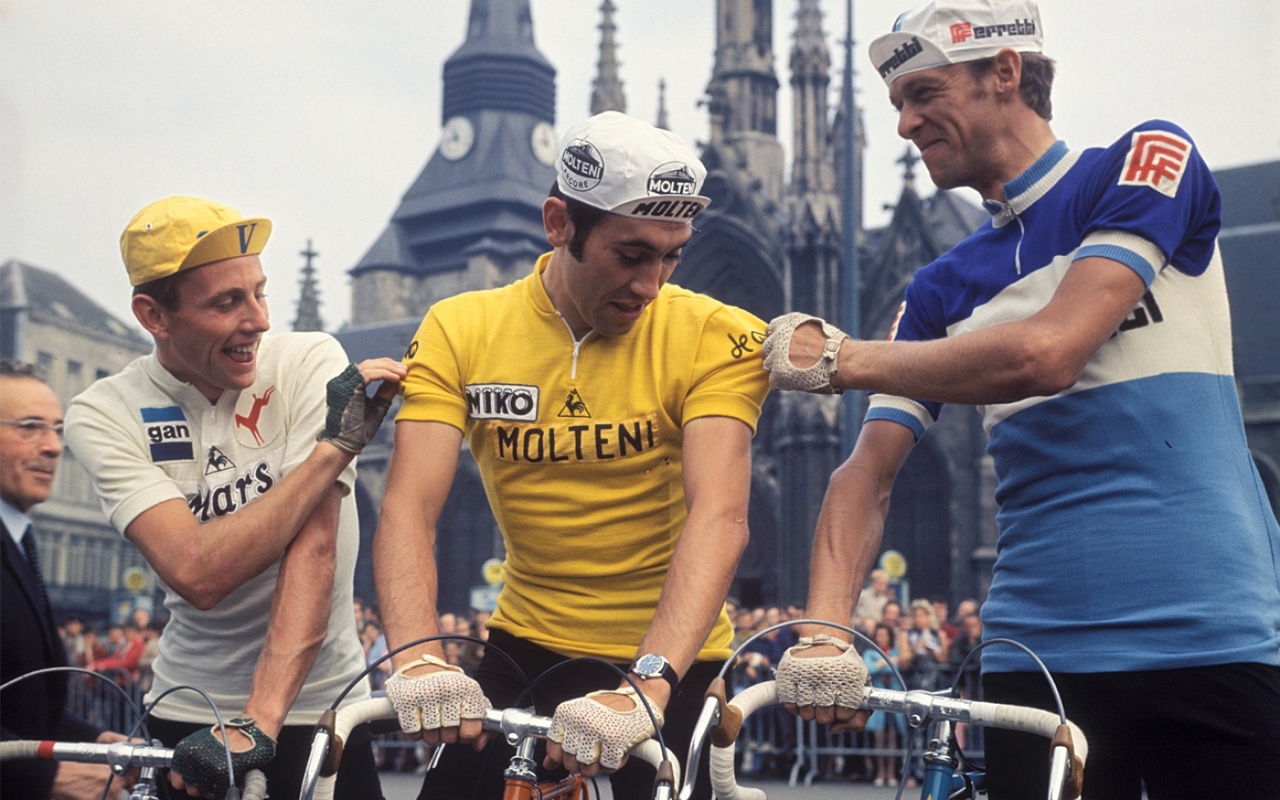
How they must wish they were born long ago, in a simpler time, when bikes were made by artisans, not robots, and they were shiny and classy, much like the automobiles of the same era. When the only substances they need ingest came from a decanter, and they could enjoy a quiet smoke along with their tipple. And they certainly long to be able to wear a long trenchcoat and Aviators on the way to the podium, or a crisp single-breasted suit with a smart Trilby, perfect attire for lounging after winning a Classic, or attending a Gentleman’s Club, rather than wrapped in nylon and dipped head to toe in fluoro paint and topped off with something more commonly seen at Yankee Stadium.
Just look at these pillars of style. They never had to fear the beginning of the season, when their DS would toss them a few plastic bags and tell them “this is what we wear this year.” They knew exactly what they were getting; solid colours, no fancy fonts, the main sponsor easily read in bold lettering, and black fucking shorts. There was no apprehension when moving to a new team about what hue of pink or aqua or yellow they would be subjected to. They knew hey were going to Look Fantastic.
Unless, of course, they’d signed for Atala.
[dmalbum path=”/velominati.com/content/Photo Galleries/[email protected]/old kit/”/]
How can you be so right and so wrong at the same time? Is it interference from the other hemisphere?
Badmouthing the Atala kit? With the prison bar motif because some Alata bikes were made by prisoners, I think. Brett, we are very far apart on this, as usual. Still, great post.
or is it more dependent on who wore it?
eh i dunno. i think Androni Giacatolli-Venezuala do a pretty good job of keepin’ it simple.
Hence why I love my Rapha classic kit
Haters gonna hate
@Barracuda guess what I got at 70% off yesterday?
@Mikael Liddy
Excellent work Sir, Im now checking my messages for the ” Im at the Rapha Store in Sydney ! Wire me some cash and Ill pick you one up ! ” text.
Love that Jersey.
Strong Kit game indeed. Im very ENVEous
@Mikael Liddy
70% off! You lucky bastard!
@Mikael Liddy well done. My kids got me the Team Phoenix Gimondi tribute jersey for my recent birthday. My kids are big into Phoenixs right now.
“when bikes were made by artisans, not robots”.
You should check out how real carbon fiber is made. Not the cheapo “I have some CF bling” stuff on low end CF bikes, but the real, hand laid stuff made by skilled people who make top end bikes, F1 cars and jets. It always amazes me that for a group who are so obsessed by the latest toys so few cyclists understand that there are two forms of carbon fiber, and just because you have a CF bike does not mean it is the same as a top end race bike.
70% off but still mo money than a V jersey?
This shirt was made to honour Eddy Merckx’s 1974 Giro win. They mistranslated Eddy’s nickname. “cannibale” should have been translated as “kannibaal”. “Vleeseter” just means “meat eater”. That’s the reason you got 70% off.
@Mikael Liddy “vleeseter” is a bad translation of “cannibal”. “vleeseter” means “meat eater”
The sheer *perch* on Bugno’s cap there … astonishing.
You know another thing those three don’t have? FACIAL HAIR.
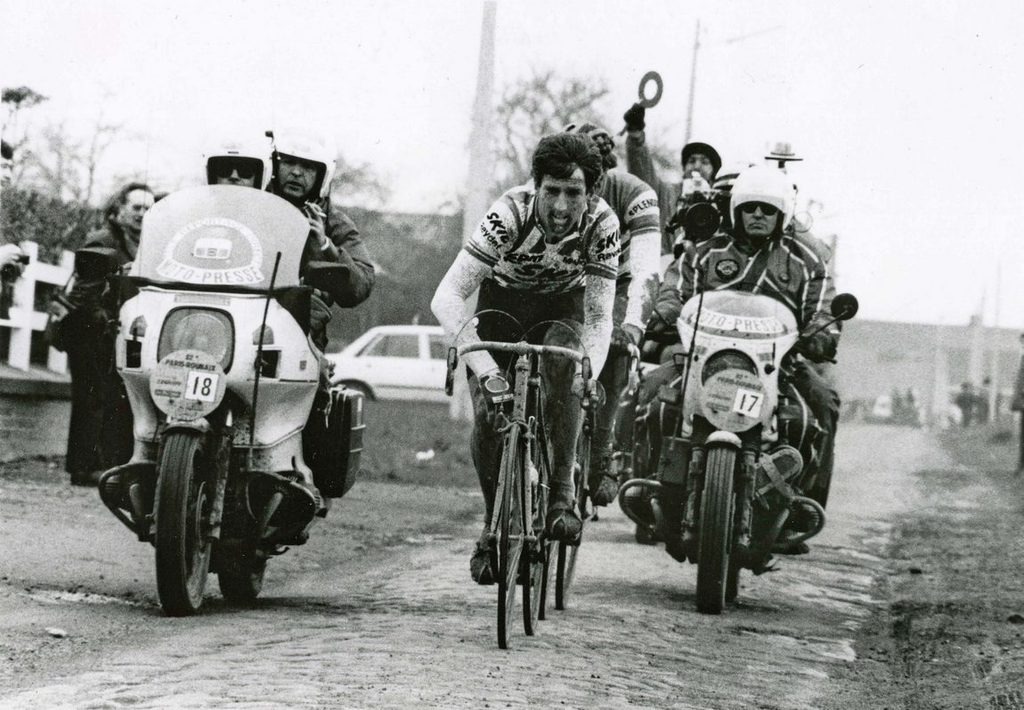
Brett, you had me 100% until you slammed Atala. Come on now, that is one of the greatest kits ever and Gianni and I stand firm on this. I mean, it was worn by Urs Freuler FFS!
Modern technology has been a blessing and a curse regarding pro kit. In the old days of wool and acrylic, things had to be kept simple because of technical issues – block colors and writing/logos that had to be sewn on letter by letter (or printed on a block of fabric then sewn on as a patch.) Riders were paid less requiring fewer sponsors, so designs could be simpler.
Modern fabrics and screenprinting technology allow for printing all manner of colors and designs. For example Mapei, one of the worst kits EVER, would be unthinkable in the old days. Those would be the good old days if that abomination was unthinkable. Higher team costs and salaries mean more sponsors so jerseys get crowded with names. Androni Giacatolli-Venezuala being a good example.
A picture of the old Peugeot kit would have been a good call. Ti-Raleigh and Del Tongo was awesome too.
Can’t have enough articles on old school kit, so great job there!
@wiscot salverini.
Also, while I don’t agree with you on the point, I have to respect your apparent high tolerance for cognitive dissonance for simultaneously praising Atala and slagging Mapei.
@Nate
Say what? Atala was well designed with a limited palette and stylish. Mapei was like someone puked colors at a jersey. It was vile. It was so bad it made Discovery jerseys look good. Even Cipo’s tiger stripe kit looked better than Mapei.The only jersey worse than Mapei was that bastard son of Saunier Duval tan and black outfit that made the riders look naked. There’s no comparison at all! Atala was classic good; Mapei, classic bad. (Insert emoticon)
I think you’ve got it exactly backwards. Mapei was a slick kit, because it took real men to dress in something that looked like it came from a clown’s fever dream.
@Owen
I have it exactly right. Mapei was crap, Atala was sweet. I wouldn’t go around telling Urs that he wasn’t a real man because he wore one of the best kits ever.
@wiscot
Urs transcended his kit. That fucker would have made Castorama look good.
It does have too many logos, but the Loto-Belisol kit this year at least seems to have been designed by someone rather than a committee. Takes quite a strong person to tell the lead sponsor that you’re writing their name in block lettering, not using their expensive corporate logo.
>>> and black fucking shorts <<< 10-4 to that ! And shoes too ! Black is just a flat out good color when it comes to cycling. Shorts, shoes, kits,bikes... I like black. I even like black Jags with bikes on top of them. Black works. Even works well on plastic bikes... and though probably not a lot of fans of this one, I happen to really dig it, cheers all:
@Al__S
Spot on. The Lotto Belisol kit is ace – and stylistically a bit of a throwback too. Proof that team kits used to be better.
@wiscot
Thank Merckx I can depend on @wiscot to jump into the fray when necessary.
@Owen
A clown’s fever dream. +1 for that. Genius.
@Nate
Making the Castorama kit look good? That’s asking a lot of any man, even a stud like Urs. Even Fignon couldn’t really pull it off and he even made having a ponytail seem kinda cool.
Just found this as an ad over on Inner Ring. Best of both worlds?
http://www.prendas.co.uk/cycle-clothing/jerseys/retro.html?p=1
@poepie
No good for me then!
@Gianni
Indeed. +1 to that man.
@wilburrox
Black shorts and shoes are great, but otherwise all black is verging just to the right of fucking boring. Our team had a hideous kit several years ago of orange and grey with black bits here and there. Though fugly, it was easy to spot teammates in the peloton. We now sport something akin to Sky minus the asymmetry and Darth Vader vibe. Off the bike it looks great, but in the field we have no clue who anybody is because so many other teams have similar kits. “Do we have someone in the break?” “Beats the shit out of me, I’m not wearing my glasses.” The pro field now has taken a similar path to the mean of black, blue and boring. The bikes too. Give us some color (like Lotto: damn fine one there) And not that neon shit of Tinkoff.
Oh and not to be a hippocrit, but ton Velo is fantastic.
Maybe the next bike will be black.
@wilburrox
She’s a beauty!
The Mapei kit is was one of the best, these Gents are stylin’ on the Atala prisoners kit.
Mapei seem to do business in Dubai and I often get a little thrill when I see their cars, decked out in the Mapei pattern. I’ll try to grab a picture of one.
Oh, good I can post again… for now. I seem to have been sent to the spam queue for the last few days.
Epo has a strange effect on the brain.
I’ll just leave this here
Ha! That pic clearly had to be posted.
As a complete kit, including steed, ANC-Halfords did a nice job. Jersey did get a bit sponsor heavy, but the colors of the kit flowing onto the Peugeot with orange tape/saddle topped off nicely with Cobalto brakes.
[dmalbum: path=”/velominati.com/wp-content/uploads/readers/sthilzy/2014.09.03.01.08.25/1//”/]
@sthilzy
@ChrissyOne Thank you Chrissy. That bike does not get raced often as I prefer my CAAD10 for that, though will race the Roubaix this weekend at state RR championship. I’d spent a little time prepping it this past w/e and couldn’t resist a snapshot and posting it. And I think your hot Synapse qualifies as black! The Synapse is getting quite a following here local as I’ve seen a super six evo just swapped out by a racer, racing less, for a “74” model Synapse frame set then built up with some gold Chris Kings to offset the black white frame. Smokin’ hot look. Also, a young lady just jumped on her new Ultegra equipped Synapse and was blown away vs her old steel frame bike. We might even see her racing it this w/e! I’m guessing you dig that bike. There is something to be said for the ride on these “endurance” type bikes. And there is some craftsmanship/artistry involved in the engineering, design and carbon lay up used to build these bikes. Cheers, RC
@wiscot The Mapei jerseys would have looked pretty good with all BLACK shorts ! So would that blue stripey jersey shown earlier in thread. Black shorts just work. Big reason I suspect for the Lotto kit being a favorite. Astana baby blue shorts?? Cannondale green??? Ugghhhh… my opinion anyways.
@wilburrox
The Synapse is actually a very dark blue. It looks bloody brilliant in the sun. =) I spent all day Monday detailing it so I just wanted to show off.
Perfection.
And more radness.
@RondeVan
Is having the legs of your shades under the straps of one’s Belgian hairnet a Rule #37 violation or do you get a pass for Awesome
@frank
Really?
errrr…..?
Wooo there! Let’s take it easy on the Castorama kit. Fignon himself designed it and was actually very proud of it.
You want bad? How ’bout this little gem from the 90’s, Chazal. Could you imagine going to battle in the Classics against Museeuw or Tchmil wearing this kit? Just slipping into it probably dropped your hematocrit level 20 points:
@the Engine
Being as that is a hairnet, not a helmet, perhaps the rule does not apply.
@Teocalli
That’s how a kit is done.
In the spirit of Sir Mix-a-Lot: “I like old kits and I cannot lie. Velominati can’t deny. . .”