Bikes of The Tour 2013
How can we not talk about the Tour? After Sunday’s stage it’s hard not to be a little excited. Until yesterday the most thrilling thing I had seen was Mark Cavendish’s mad man chase back to the peloton after a late-in-the-race crash. He needed to get back quickly as the race was hurtling toward a sprint finish he was supposed to win. Happily there was a TV moto trying to follow him. For much of the chase he was without teammates, picking his way through the following convoy at high speed, jumping curbs, drafting cars very close, zipping around everything with millimeters to spare. He is a sprinter. These scenes are happening during every stage but the TV viewers miss almost all of it.
And now the rant…
Are all carbon monocoque bikes getting uglier as their computer aided design becomes more and more functional? Engineers are designing for a combination of aerodynamics, weight, stiffness but badass looks are not a design parameter. BMC has been crowing about some new software that produces the best design after a zillion Monte Carlo simulations but man, that damn thing is not pretty. All the monocoque frames must be heading toward the same computer derived solution, but not quite yet.
I’m sorry to offend Pinarello owners but the new Dogma is incrementally uglier than all the other preceding ugly Dogmas. It pains me to say this. I am a devout Italophile and longtime admirerer of Pinarello bikes. And I’m the one around here lecturing about form following function, but this bike is wrong. I realize the kinky stays and fork blades are shaped that way for performance, aren’t they? The frame looks like it stayed in the easy-bake oven too long and everything got a bit wobbly before it cooled. The front fork is a horror, the seat stays are bent the wrong direction, the chain stays don’t match.
The all carbon-weave clear coat frames are boring. Pinarello takes a lot of pride in their paint and for that I salute them. Luckily Sky’s and Movistar’s bikes are painted glossy and dark. It’s harder to see just how nasty the front fork is. With all the frame designs stuttering toward the same solution, it’s the paint that sets them apart. Matte black Orbeas and Bianchis look nearly identical until the orange or celeste paint goes on.
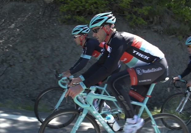
Trek has also been into the paint for its frames. Thankfully one doesn’t see a carbon clear-coat Madone. They have a new weight- saving paint this year and for the Tour they unleashed a beautiful mono-pantone “lei ‘o pard blue” (not to be confused with leopard blue) for the Shack rides. Now that is a paint job! The new Madone is ugly. There, I said it, but the damn paint saves its kammtail ass. Its head tube, or what used to be the head tube looks clumsy. At least the Trek bikes have a proper front fork and it’s painted that great color, as is the seat mast. Would I like the Pinarello if it was painted up like this? Yes I’d like it a lot more but I can’t get around the wavy fork. The first time I saw a steel Colnago with straight fork I fell in love. It shouldn’t even work but does. I’d never considered that a front fork could be straight. Straight fork yes, wavy fork no. Is it just me? Obviously it is as every Pinarello has a noodle fork and they are selling nicely. What does Ernesto Colnago say about a Pinarello? Believe me, I wish I knew. The Colnago C-59 is a fantastic looking bike and if that was painted completely “leopard” blue, my head might explode.
[dmalbum path=”/velominati.com/content/Photo Galleries/[email protected]/Bikes of the Tour/”/]