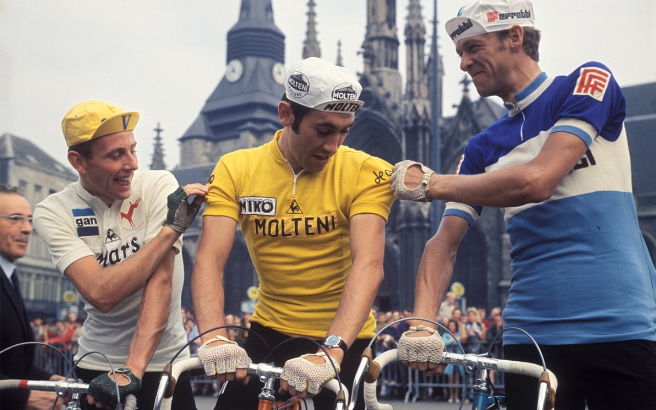
How they must wish they were born long ago, in a simpler time, when bikes were made by artisans, not robots, and they were shiny and classy, much like the automobiles of the same era. When the only substances they need ingest came from a decanter, and they could enjoy a quiet smoke along with their tipple. And they certainly long to be able to wear a long trenchcoat and Aviators on the way to the podium, or a crisp single-breasted suit with a smart Trilby, perfect attire for lounging after winning a Classic, or attending a Gentleman’s Club, rather than wrapped in nylon and dipped head to toe in fluoro paint and topped off with something more commonly seen at Yankee Stadium.
Just look at these pillars of style. They never had to fear the beginning of the season, when their DS would toss them a few plastic bags and tell them “this is what we wear this year.” They knew exactly what they were getting; solid colours, no fancy fonts, the main sponsor easily read in bold lettering, and black fucking shorts. There was no apprehension when moving to a new team about what hue of pink or aqua or yellow they would be subjected to. They knew hey were going to Look Fantastic.
Unless, of course, they’d signed for Atala.
[dmalbum path=”/velominati.com/content/Photo Galleries/brettok@velominati.com/old kit/”/]
I know as well as any of you that I've been checked out lately, kind…
Peter Sagan has undergone quite the transformation over the years; starting as a brash and…
The Women's road race has to be my favorite one-day road race after Paris-Roubaix and…
Holy fuckballs. I've never been this late ever on a VSP. I mean, I've missed…
This week we are currently in is the most boring week of the year. After…
I have memories of my life before Cycling, but as the years wear slowly on…
View Comments
>>> and black fucking shorts
@Al__S
Spot on. The Lotto Belisol kit is ace - and stylistically a bit of a throwback too. Proof that team kits used to be better.
@wiscot
Thank Merckx I can depend on @wiscot to jump into the fray when necessary.
@Owen
A clown's fever dream. +1 for that. Genius.
@Nate
Making the Castorama kit look good? That's asking a lot of any man, even a stud like Urs. Even Fignon couldn't really pull it off and he even made having a ponytail seem kinda cool.
Just found this as an ad over on Inner Ring. Best of both worlds?
http://www.prendas.co.uk/cycle-clothing/jerseys/retro.html?p=1
@poepie
No good for me then!
@Gianni
Indeed. +1 to that man.
@wilburrox
Black shorts and shoes are great, but otherwise all black is verging just to the right of fucking boring. Our team had a hideous kit several years ago of orange and grey with black bits here and there. Though fugly, it was easy to spot teammates in the peloton. We now sport something akin to Sky minus the asymmetry and Darth Vader vibe. Off the bike it looks great, but in the field we have no clue who anybody is because so many other teams have similar kits. "Do we have someone in the break?" "Beats the shit out of me, I'm not wearing my glasses." The pro field now has taken a similar path to the mean of black, blue and boring. The bikes too. Give us some color (like Lotto: damn fine one there) And not that neon shit of Tinkoff.
Oh and not to be a hippocrit, but ton Velo is fantastic.
Maybe the next bike will be black.